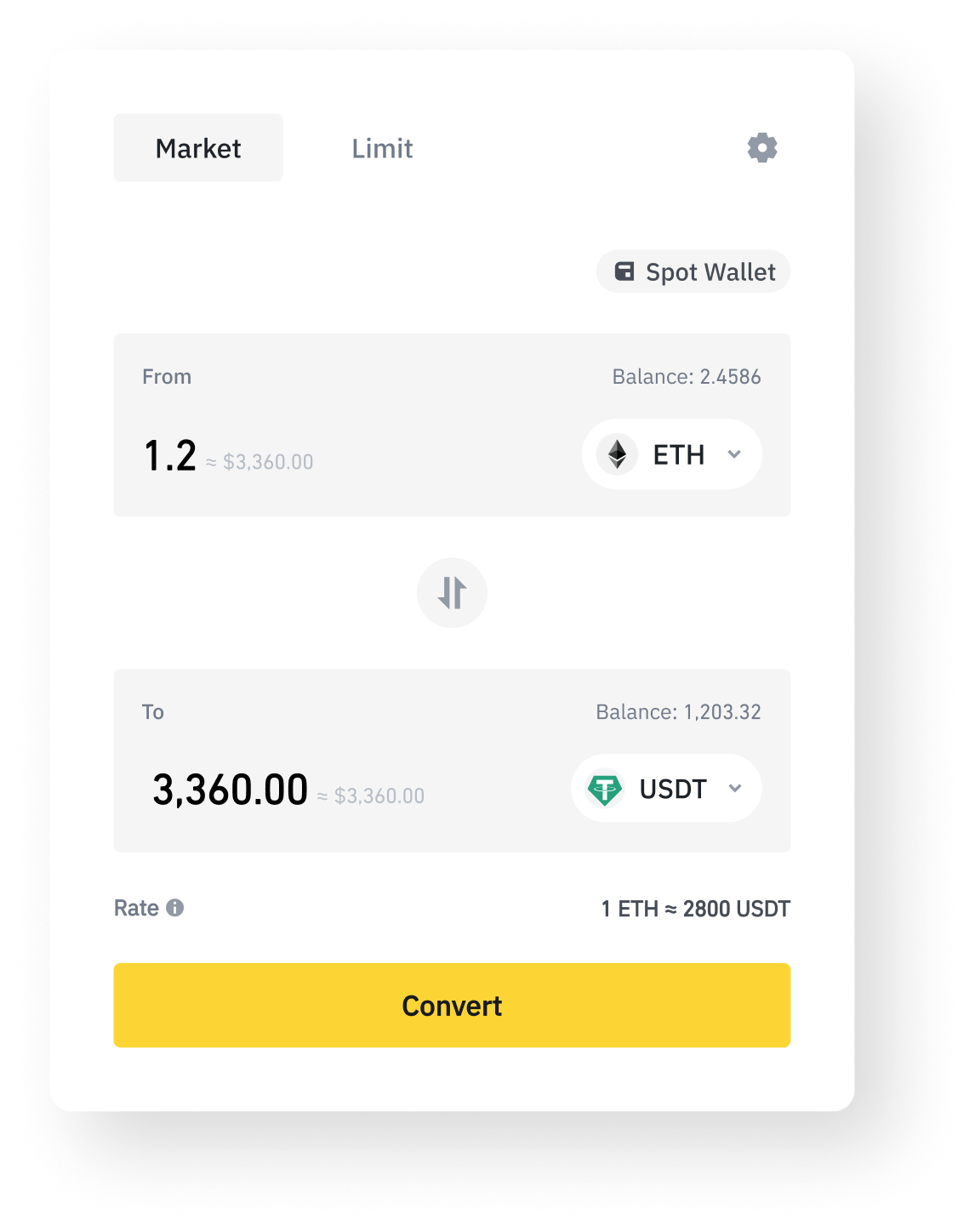
Show the result as you type.
The old flow revealed the outcome only after a Preview step. Computing the converted amount and its fiat estimate live removes that round trip, so the moment of deciding and the moment of knowing become the same.
Binance Convert
Convert is where Binance users swap one asset for another without touching an advanced trading screen. Support tickets showed the flow was frustrating people: prices lived on other pages, records were hard to find, and switching wallets took too many steps. I led the revamp that turned those complaints into a clearer product.
Problem
Convert was meant to be the easy way to swap assets, but customer-service chat volume kept surfacing the same conversion pains. Reading those tickets against the interface, the friction resolved into four concrete flaws.
Research
I grouped the customer-service chat data by complaint type, then mapped each complaint to a specific point on the old Convert screen. The audit surfaced five spatial problems.
My Role
I led UI/UX for the Convert revamp, working alongside one other designer and partnering with product and engineering through implementation. My work covered synthesizing the feedback, flow structure, interaction states, high-fidelity UI for web and app, and the shared Convert component.
Solutions
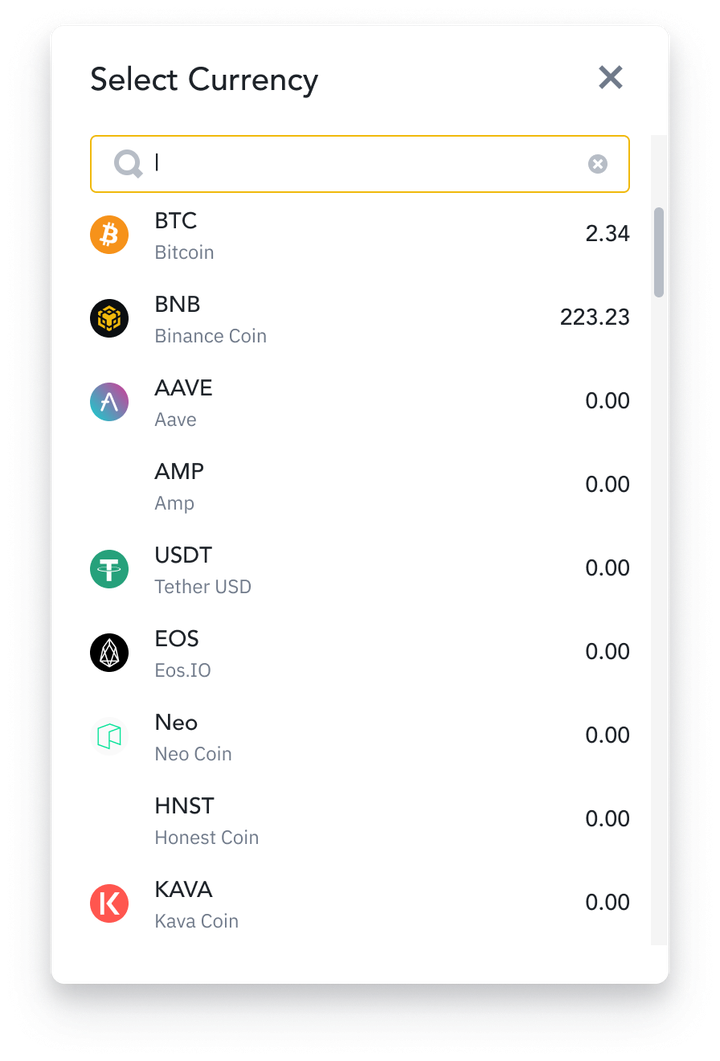
The revamped Market flow shows the converted amount as you type, keeps balances and the wallet source visible, and puts asset swapping one tap away. Selecting an asset opens a searchable list with live balances instead of sending users hunting.
For users who want context before committing, Limit mode embeds a K-line chart beside the Convert panel and lists recent trades directly beneath it, so checking the market and reviewing history no longer means leaving the page.
Interaction Spec
A conversion form looks simple until you count its states. I specced the interactive logic of the new input field so engineering had an unambiguous answer for every edge: the empty focus state with range hints, amounts below the trade minimum, amounts over the available balance, both errors at once, 14-digit inputs, and extreme ranges for small-unit assets. The states below step through that spec, one decision at a time.
Each state resolves one ambiguity identified in the old flow. All states share one fixed rate, 1 ETH = 2800 USDT, so every number on screen can be checked.
Key Decisions
The old flow revealed the outcome only after a Preview step. Computing the converted amount and its fiat estimate live removes that round trip, so the moment of deciding and the moment of knowing become the same.
The design prioritizes the last conversion over a full archive. Five recent trades beneath the panel answer the did-it-go-through check while keeping Convert a converter, not a history page.
Market users want speed, and a K-line chart in that flow is noise. Embedding it in Limit mode puts price context exactly where the decision depends on it and keeps the default flow calm.
The stepper crowded the input and split attention from the amount. Visible balances and a one-tap wallet chip cover its real job of filling amounts, with less furniture around the number that matters.
Outcome
The revamp shipped across Market and Limit modes on web and app. Amounts and balances became visible in place, recent trades and market data moved into the flow, and wallet switching collapsed to a single tap.
The support queue set the success criterion: reduce questions caused by unclear quotes, hidden history, missing market context, and wallet switching. I no longer have access to a clean post-launch reporting window, so I do not attach a percentage to that outcome.
For financial tools, the best design often feels quiet. The support queue was the brief: fix the specific moments where users could not verify what would happen next, and keep the redesign grounded in problems people actually reported.
Next Case Study
Lean MVP testing across device setup, art discovery, and purchasing for a connected display ecosystem.