Separate setup from discovery.
Device management needed functional clarity, while art browsing needed space and a calmer rhythm. Keeping them distinct let each feel right.
Framed*
Framed* is a connected display that streams digital art onto your wall. As the first and only designer, I shaped the app and brand that let people pair a device, discover and share art, and send it to the wall in a couple of taps.
Problem
Framed* users manage a physical display, browse and follow art, and can purchase work. Each task carries a different expectation: setup should be direct, discovery should feel inviting, and sending art to the wall should feel effortless. The design job was to make a device, a social feed, and a store read as a single product.
Constraints
My Role
I was the first and only designer at Framed*, splitting my time between UI design and visual design for the brand. I owned the app end to end, from information architecture and flows to high-fidelity screens, and iterated with the team on sharing, device management, and art discovery.
Process
Structuring explore, device, and user paths together surfaced the hard parts early: pairing a Wi-Fi device, deciding when a feed is public or private, and making "send to device" reachable from anywhere a user meets art.
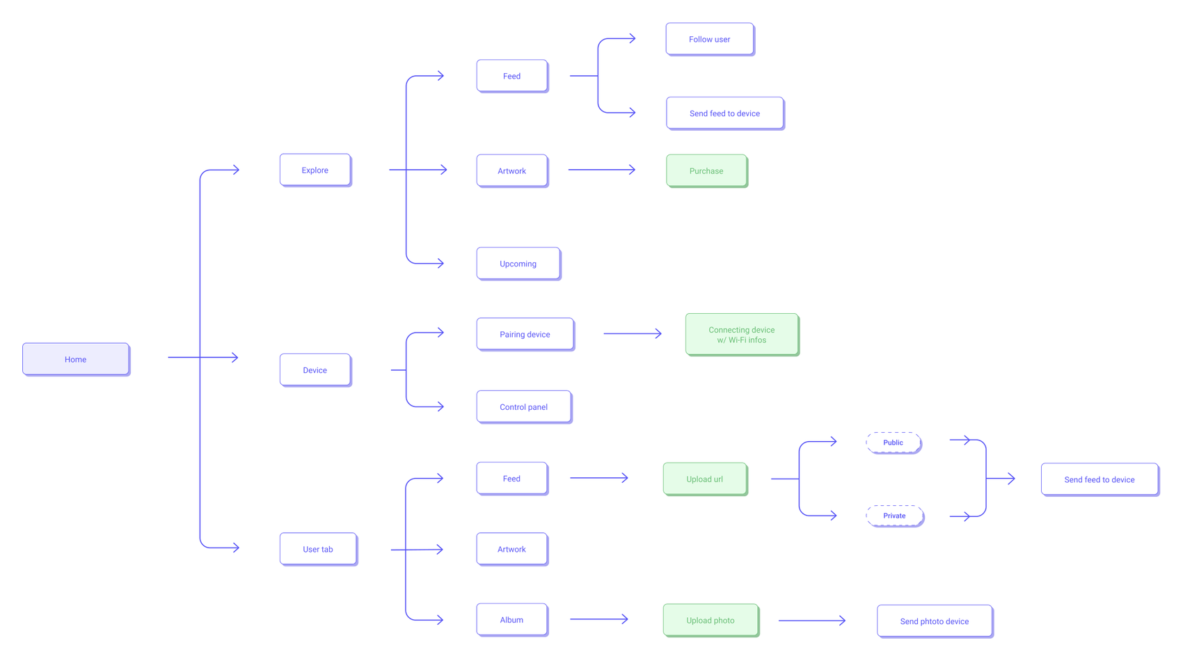
Device Control
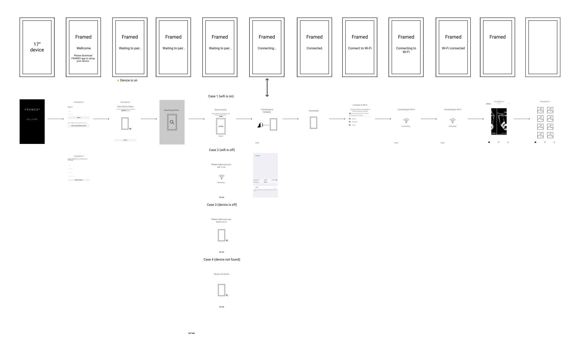
Pairing had to work with no camera and no Bluetooth, only a Wi-Fi connection. I specced the device screen and the app screen as two parallel tracks, so every step in the app had a matching state on the wall. Step through the sequence below, and the branches where it fails.
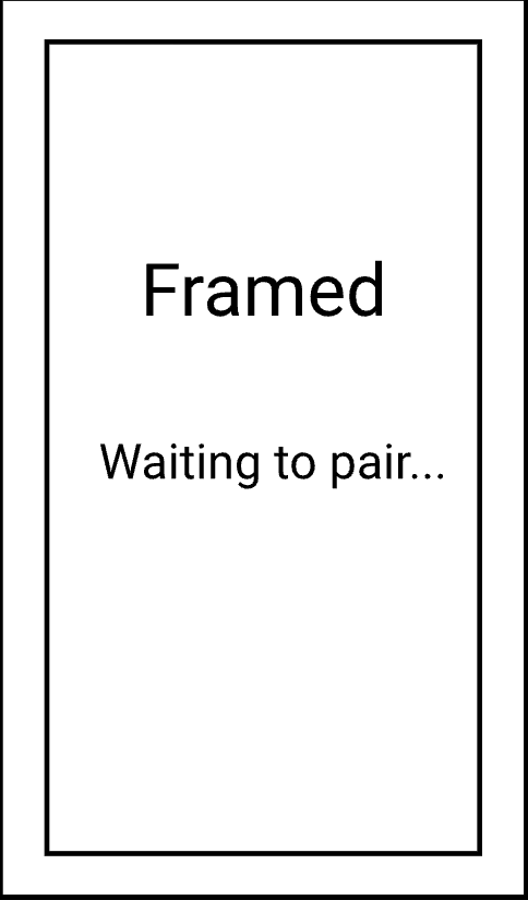
Pairing Walkthrough
Failure Branches
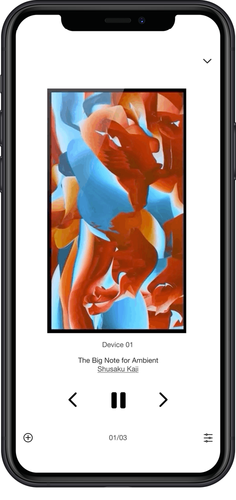
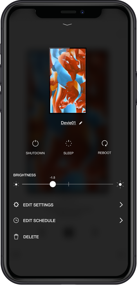
Once paired, the app acts as the display's remote: a live preview of what is playing, and a control panel for brightness, scheduling, and settings. I kept the artwork front and center and pushed the utilitarian controls into a calm, secondary layer.
Feed and Discovery
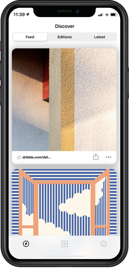
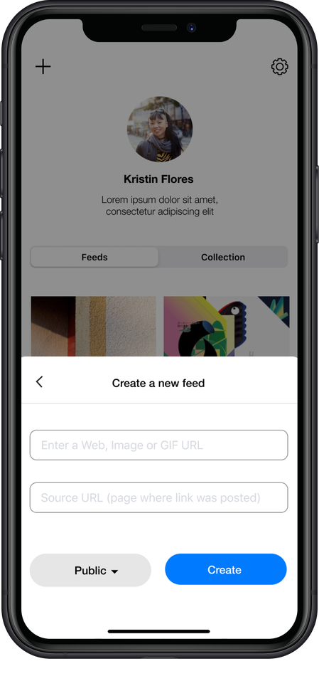
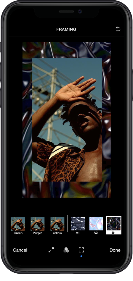
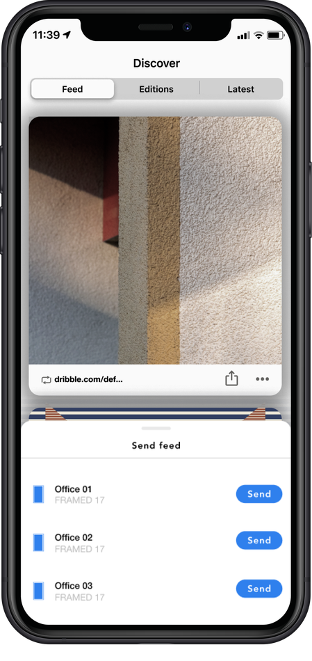
The Feed lets people discover and share media from across the web, follow like-minded users, and curate collections. From almost anywhere in the app, a piece can be framed and sent straight to the device, so the distance between finding art and living with it stays short.
Key Decisions
Device management needed functional clarity, while art browsing needed space and a calmer rhythm. Keeping them distinct let each feel right.
With no physical tether, I made pairing a guided, legible flow so connecting a device felt reliable rather than fragile.
Visual restraint protected the art-forward brand, while interaction detail carried the product utility underneath it.
"Send to device" was reachable from feeds, profiles, and albums, shortening the path from finding a piece to seeing it on the wall.
Outcome
The shipped product brought the app, website, device controls, and marketplace into one connected Framed* experience. Users could pair the display over Wi-Fi, discover art, and send it to the wall from the same app. The team did not use product analytics to measure this work, so I present it as shipped scope rather than a measured engagement result.
Connected products need two kinds of clarity at once: what the user is doing on screen, and what that action changes in the physical world. Designing for both is what made Framed* feel like one product instead of an app bolted onto a device.
Next Case Study
UI/UX for blockchain digital-property tools and Bitmark Health, turning issuance, transfer, and consent into flows people could trust.