Make ownership tangible.
Instead of crypto vocabulary, the products spoke in terms of registering, holding, and transferring property, a model people already understand from the physical world.
Bitmark
At Bitmark I designed two products built on the same hard idea: letting people register, hold, and transfer the things they own, whether digital property or personal health data, on an independent blockchain. The work was making an unfamiliar concept feel concrete and safe to act on.
Problem
Bitmark let users turn digital assets and personal data into registered property on an independent blockchain. Powerful, but abstract: users had to grasp issuance, ownership, transfer, recovery phrases, and consent before they would trust the product with something valuable. If those ideas stayed technical, people stalled.
Constraints
My Role
I owned UI/UX for both products from the beginning, covering flows, high-fidelity screens, and interaction detail, working closely with the business and engineering teams. I built alternate prototypes to make unfamiliar concepts concrete and kept both products aligned to the brand as they grew.
Digital Property
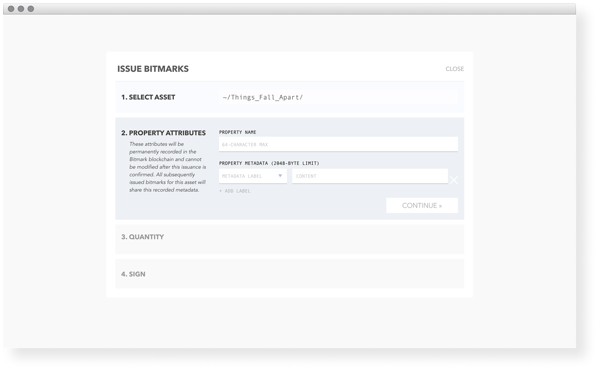
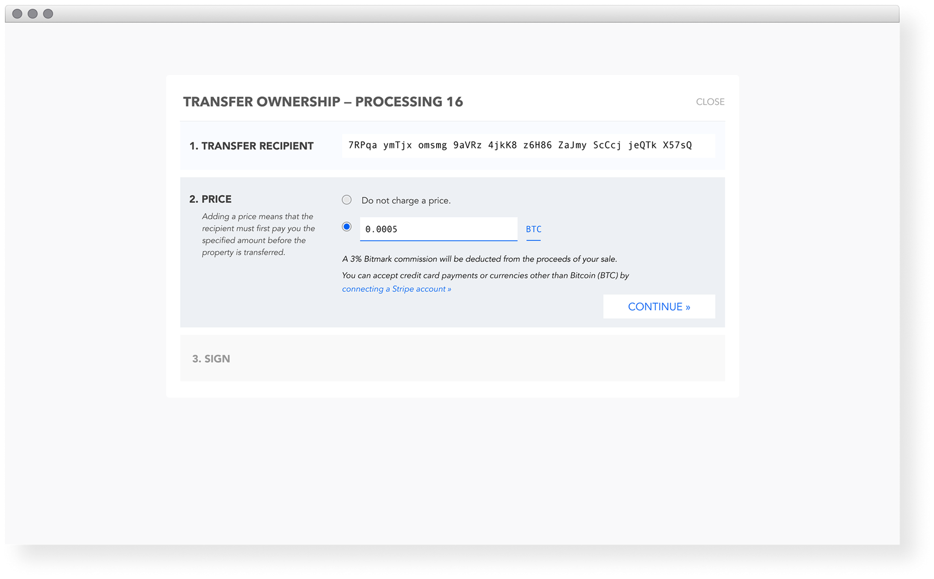
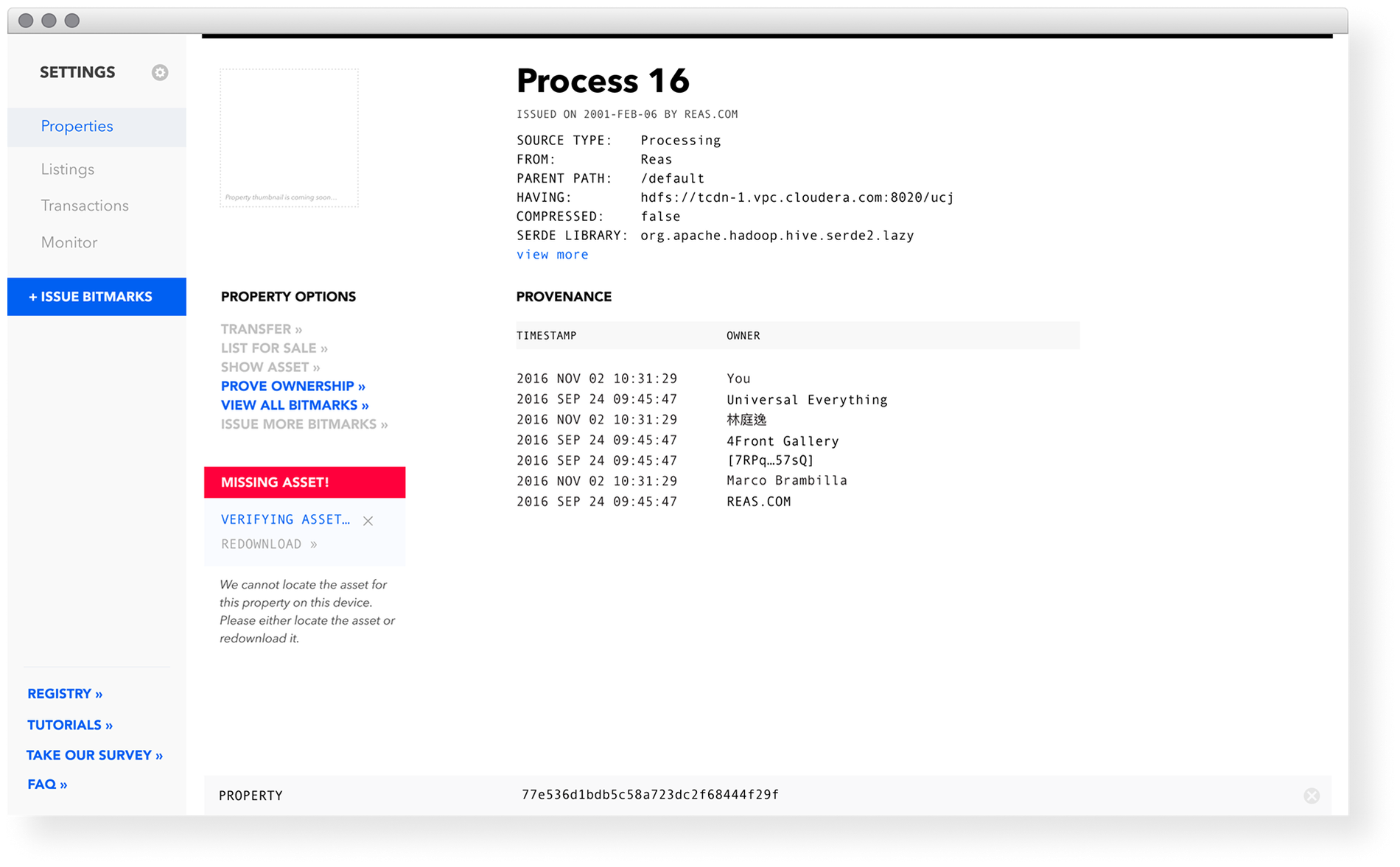
The web app let users register digital properties, issue limited assets, and trade them on a secure independent blockchain. I structured each blockchain action as a step with a clear recipient, price, and confirmation, so transferring ownership read like a transaction, not a cryptographic operation.
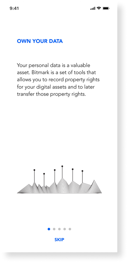
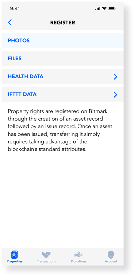
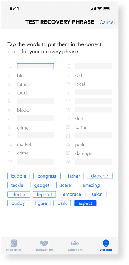
On mobile, the same model had to fit a wallet. Onboarding explained ownership in plain language, registration pulled from sources people recognised, and the recovery phrase, usually the scariest part of any crypto product, was designed as a guided, checkable step.
Bitmark Health
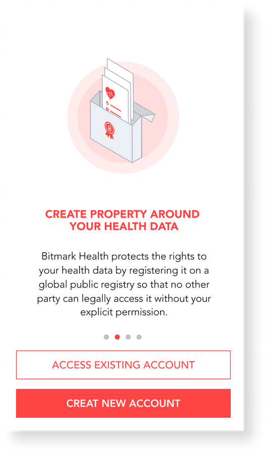
Bitmark Health let people register their health data as property on a public registry, so no one could access it without explicit permission, and optionally donate it to medical research. I led the iOS design end to end, framing onboarding around the new mental model of "creating property around your data" and making consent legible at every step.
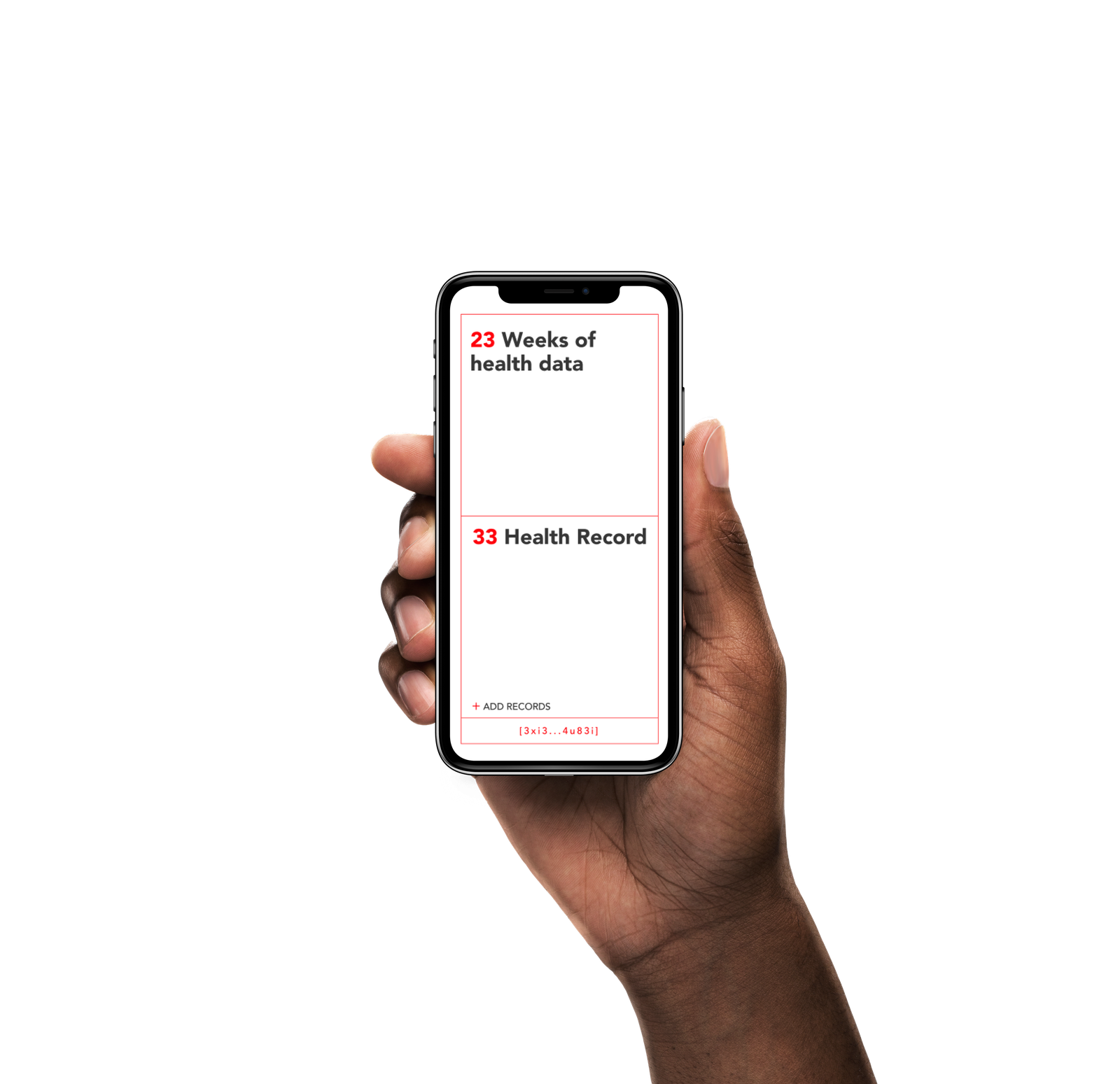
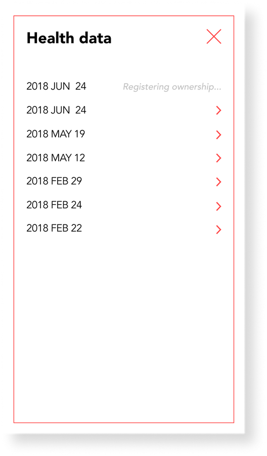
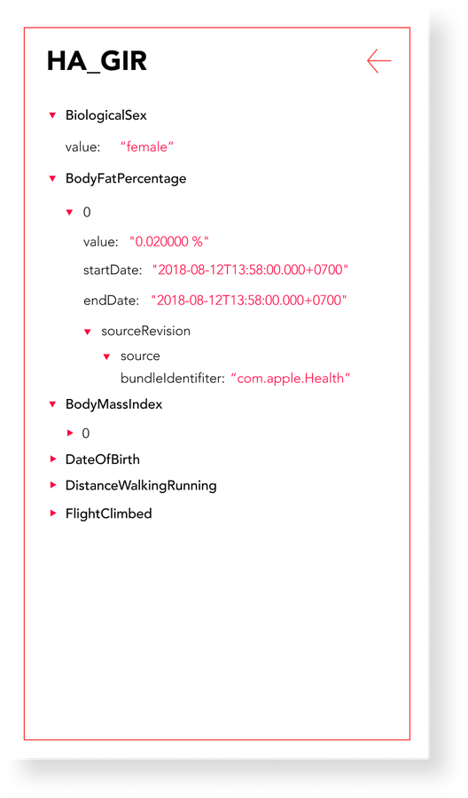

The record-adding flow was built as two clickable variants so the team could compare the interaction sequence. I no longer have a recorded test result, so the prototypes are shown here as exploration evidence rather than proof of validation.
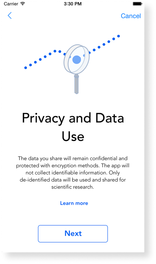
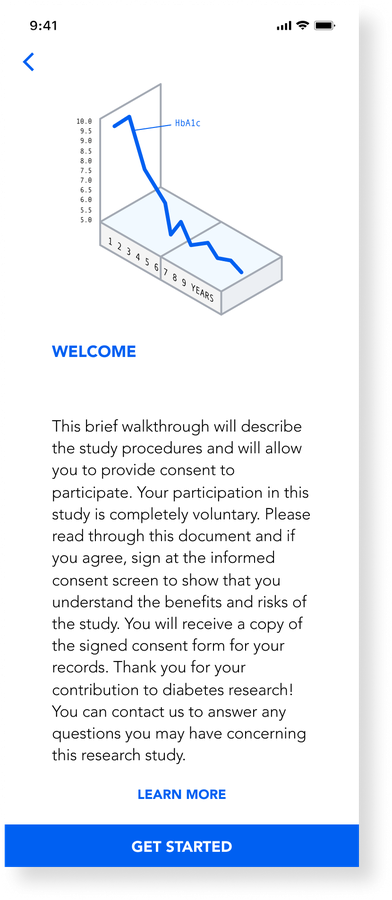
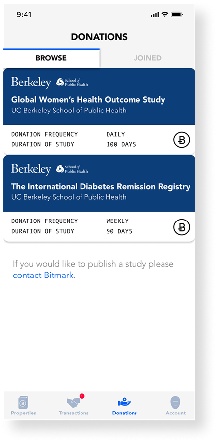
For data donation, I reframed the onboarding into a clear, illustrated sequence covering what a study is, how data is used, and what consent means, so a genuinely new idea felt approachable rather than alarming.

Key Decisions
Instead of crypto vocabulary, the products spoke in terms of registering, holding, and transferring property, a model people already understand from the physical world.
Recovery phrases and data permissions were designed as first-class steps, not fine print, so users understood what they controlled before committing anything.
I reframed the onboarding flows with the product team and built a clearer, illustrated icon set, lowering the difficulty of new concepts like data donation.
Two working prototypes exposed the interaction differences before further investment. Because the measured result was not recorded, they remain evidence of exploration, not a validated winner.
Outcome
Across both products, the design work gave issuance, transfer, recovery, consent, and donation a consistent interaction language the team could keep building on as features shipped. Bitmark Health shipped with real research partners: the donation flow connected users to public-health studies run by UC Berkeley researchers.
This was early proof of what still drives my work: when a product is built on an unfamiliar system, the real design problem is comprehension. Structure and language do more to earn trust than visual polish.
Next Case Study
End-to-end product design for trading, yield, and Web3 interactions where clarity has to come before capital.