Six kinds of betting data on one screen, and three seconds to decide.
Sozu is an AI-first prediction app. The brief asked for a Game Detail screen carrying six kinds of data, a brand system built from scratch, and one quality above all: fast clarity, not clutter. This case is how I turned that into a number I could design against, then cut 40 percent of the data to hit it.
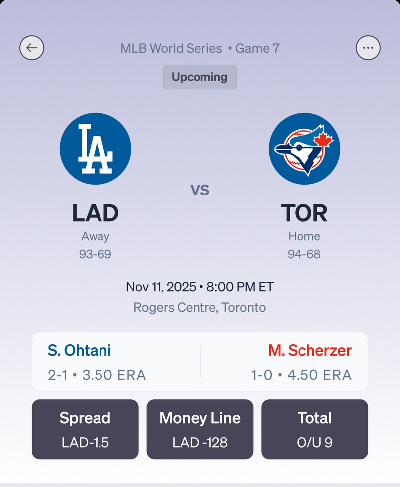
Scope: One high-fidelity iOS screen and the mini brand system behind it, solo. I set it on a fictional decisive Game 7, tied 3-3, to stress fast clarity at maximum urgency. The baseball data is realistic but fabricated.
Key decision: Rank by decision value, not by availability. If a number cannot change a bet, it does not ship, even when the brief asked for it.
Honest limit: Three seconds is a target I set, not a result I measured. The last section names the untested assumptions and the study that would settle them.
Problem
Most prediction apps fail in one of two directions, and both cost the same thing.
The brief named six sections for one screen: match snapshot, head-to-head history, odds comparison, injury report, stadium and weather, and pundit predictions. It asked for a mini brand system to go with them, and set one bar: fast clarity, not clutter, because users need confidence to decide quickly.
That is the trap. Hide the data behind tabs and users pay a navigation tax on every question. Dump it all at once and they pay a reading tax instead. Either way the confidence arrives too late to be worth anything.
The brief never said how quickly. Fast clarity is a feeling, and a feeling cannot be designed against or checked afterwards. So I set the number myself: three seconds from opening the screen to knowing what the game is and where the odds sit. Every decision below was argued against that target, and the last section is how I would test whether I hit it.
Constraints and Role
Constraints
Six categories on one mobile screen. Both clubs play in blue, so the series trend could not depend on team color. Best price had to be obvious across four sportsbooks, while price is not every bettor's definition of value. The data is constructed, so nothing here may imply live data or a launch.
My Role
Solo, from brief to final screen: hierarchy, the reduction call, section structure, micro patterns, the interface, and the mini system. No researcher to hand me a persona and no analytics to settle an argument, so every decision here rests on reasoning I have to defend out loud.
Structure
What is this? Should I bet? What else should I know?
Three layers, each with a time budget, following how a decision actually forms: an instant impression, then evidence that tests it, then the detail that closes the remaining doubt.
Instant readLayer 1 · 0 to 3 sec
What is this? Match snapshot and series score, no scrolling. Who is playing, what is at stake, where the odds sit. Like walking into a dark room and having someone turn the light on.
Confidence buildingLayer 2 · 3 to 10 sec
Should I bet? Odds comparison, injuries, expert consensus. Where gut meets evidence and the user tests that first impression.
ContextLayer 3 · 10 sec plus
What else should I know? Stadium, surface, weather. Not everyone needs it, but it is there for users who want every detail first.
A layer states importance, not vertical order. Stadium sits above expert consensus on purpose: conditions are facts, picks are interpretations of those facts. Like a courtroom, the evidence comes first and the closing argument last.
Screen Anatomy
Six sections, one job each.
Each section had to justify its space by naming the decision it supports.
Subtraction, not addition. Season records ground users in reality before the Game 7 drama, so a tied series makes sense. Ohtani versus Scherzer reads as ace versus ace to anyone who follows baseball. Anything unusable in the first three seconds was removed.
Section by Section
Every section names the decision it supports.
Select a section to see what it does and why it earns its place.
Assembled: scroll the frame to read the full screen
Key Decisions
Four calls, each with a cost I can name.
01 · Encoding
Position first, color second.
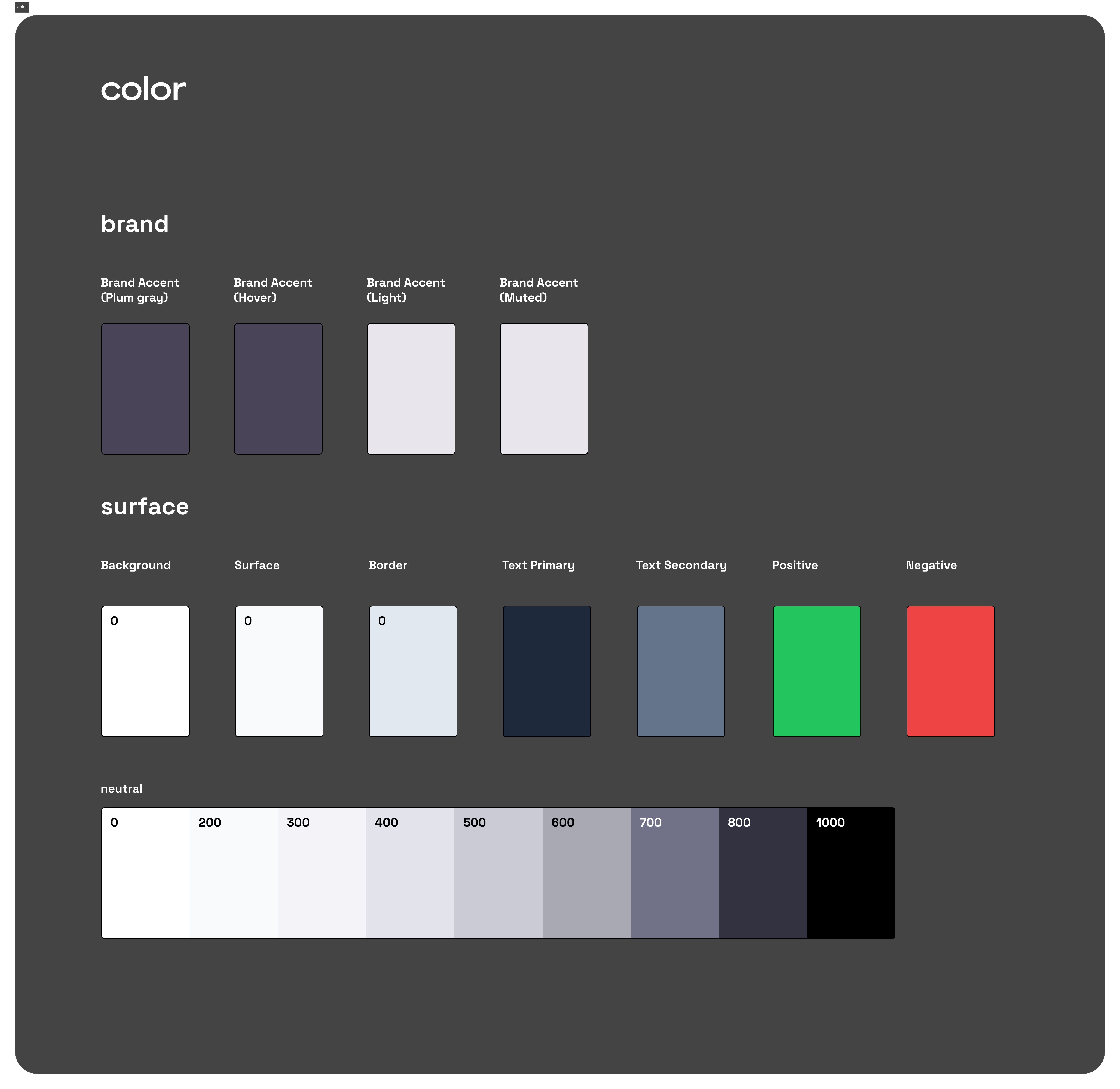
Both clubs play in blue, so color alone could not carry who won which game. Position solves it without asking anyone to learn anything: wins above the centerline are always Dodgers, below are always Blue Jays, and the chart survives grayscale. Only then did I move Toronto to maple red, as a second cue the layout no longer depends on. Red is defensible for a Canadian club rather than arbitrary.
Tradeoff: Toronto's official blue is gone. Brand accuracy for a chart readable at a glance, and I would trade it again.
02 · Advice
BEST is a claim, and the claim is price.
A callout converts the spread between four books into money: DraftKings saves you $8 per $100 versus FanDuel. That is the jump from showing numbers to giving advice. It is also an opinion. By marking one book BEST on price, I decided for the user that price matters most, when some care more about a platform they trust or how fast it pays out. Letting users define best themselves means a settings surface, which means clutter.
Tradeoff: flexibility for speed. This is an 80/20 call: power users lose control, most users get an answer.
03 · Subtraction
I removed about 40 percent of the data that was asked for.
The test was whether a number can change a bet. Team A scored 37 runs across six games is interesting and useless: it does not help you predict Game 7. The argument is not minimalism, it is that people need confidence rather than completeness. A stat that cannot be acted on still spends attention, and attention was the whole budget.
Tradeoff: the decision a client pushes back on hardest, and the counter-argument I would need is usage data a concept cannot produce.
04 · Trust
The app shows where it ranks, including when it loses.
The consensus section carries the model's own scorecard: Sozu AI picks a Dodgers win at 58 percent accuracy, next to ESPN at 82 and The Athletic at 74. The app's prediction is not the most accurate one on its own screen. A product that only displays its wins is a marketing surface; one that shows its record lets users calibrate how much to trust it, which is what makes the number worth printing.
Tradeoff: the headline prediction looks weaker. An honest signal is worth more than a confident one users cannot check.
The System
The system was a deliverable. What each part protects was the decision.
Colors, typography, spacing, icon style, and micro patterns were all named, to be built from scratch as if this were a brand-new product. Nothing about that list says what any of it is for, and that is the part worth arguing about.
Plum gray, because the brand had to stay out of the way of meaning. Green already means best price and probable, red means out and danger. A green or red brand would compete with the signals users need to read. Plum gray leaves them their jobs, and its smoky, about-to-happen quality suits a prediction product.
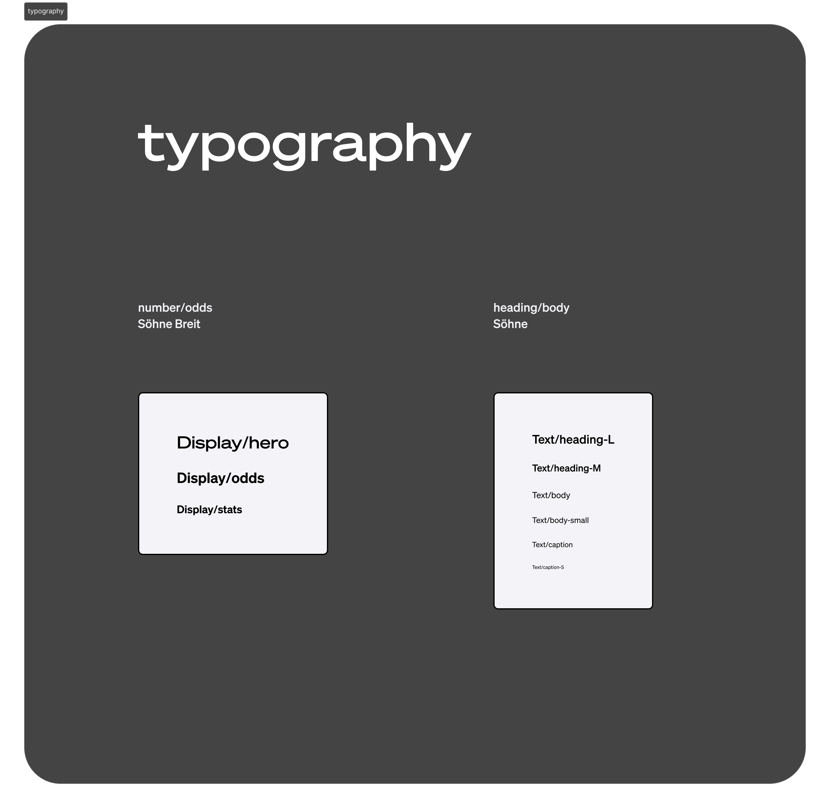
Söhne for reading, Söhne Breit for numbers. Odds and scores use tabular figures, so columns align and a price change does not shift the layout underneath it. Spacing runs on an 8pt grid, every value a multiple of 4. Nobody notices the grid, they notice its absence.
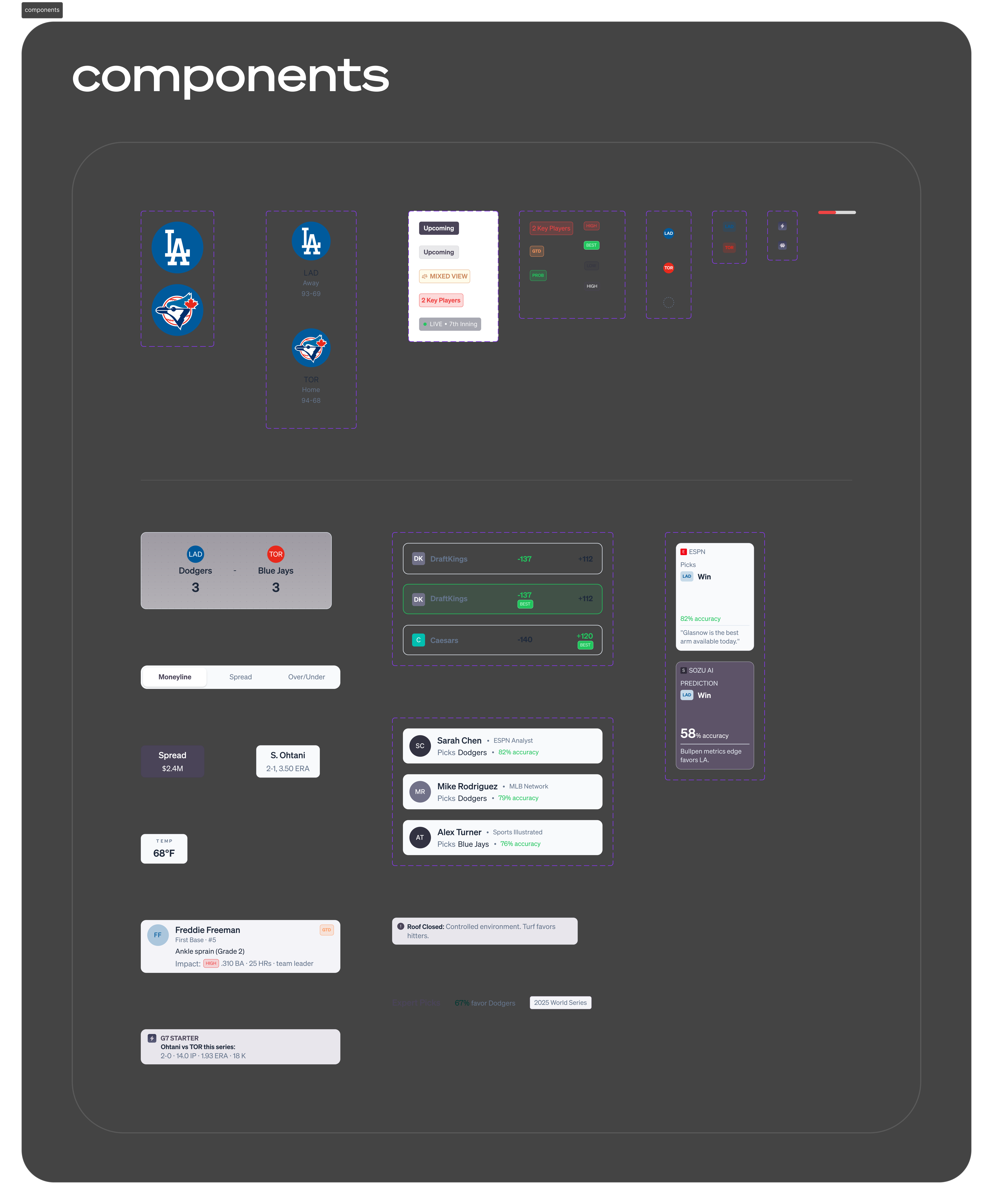
Eight micro patterns carry the whole screen, each double-coded so nothing depends on color alone. Same pattern, same meaning, everywhere: that is what makes six sections read as one product, and a seventh cheap to add.
BEST badgeOddsGreen text plus a badge, so it survives grayscale
Status chipInjuriesOUT, GTD, or PROB, always with the word
Impact badgeInjuriesHIGH, MED, or LOW: does the absence matter
Snap noteSeries, odds, stadiumOne actionable line, marked by a lightning icon
Section headerAll sectionsTitle left, status or count badge right
Consensus barExpertsProportional split, labels outside the bar
Tab barOddsOne bet type at a time
Team dotTimeline, tablesOne mark identifying LAD or TOR anywhere
Two families: Söhne Breit for numbers, Söhne for readingBrand stays neutral so green and red keep their meaning
The micro patterns the six sections are assembled from
Design Outcome
6data domains resolved on one screen
3layers, from gut to evidence to context
8micro patterns, one meaning each
40%of requested data removed
One high-fidelity screen plus the system behind it. No production metrics, fabricated data, and a three-second read that is a target I set rather than a result I measured. What it produced is a position I can defend: the screen answers what is this, should I bet, and what else should I know, in that order, and every section states the decision it serves.
What I have not proven, and how I would test it.
Three claims here are still assumptions: that the screen is readable in three seconds, that the 40 percent I removed was the right 40 percent, and that position encoding actually beats color for a distracted user rather than just satisfying an accessibility rule.
All three fall to the same cheap study. Show the screen for five seconds, take it away, then ask: who is playing and what is at stake, where is the best price, and which single fact would most change your bet. The first tests Layer 1 and the three-second target. The second tests whether the BEST badge works or just decorates. The third tests the subtraction: if people name something I cut, I cut wrong. Run it once in grayscale and the position argument settles itself.
That study comes before the polish I would otherwise reach for: motion on the best-odds badge, a dark mode for the hours people actually bet in, an icon set that carries the brand instead of borrowing one. The subtraction is the work I would defend hardest and the work with the thinnest evidence. Taste got me to the answer; only the test would prove it, and knowing which half is which is the point.
Next Case Study
Designing perps, options, and liquidity products traders can trust with real capital.
Sole product designer for a DeFi derivatives protocol on Sui: eight product surfaces, a token-based design system, and a full rebrand.